Highly-multiplexed image analysis with Harpy#
In this notebook we will import an unprocessed spatial proteomics dataset from the MACSima platform and perform some cell segmentation and feature calculation using Harpy.
from matplotlib import pyplot as plt

import harpy as hp
1. Load the example dataset#
The example dataset for this notebook will be downloaded and cached using pooch via harpy.dataset.registry. The dataset is a small subset of a larger dataset that was generated using the MACSima platform.
sdata = hp.datasets.macsima_example()
microns_per_pixel = 0.17  # microns per pixel for this dataset
sdata
WARNING  Module 'bioio' is not installed. Install it with `pip install bioio` to use `harpy.io.macsima`.
WARNING  Module 'bioio-ome-tiff' is not installed. Install it with `pip install bioio-ome-tiff` to use
         `harpy.io.macsima`.
SpatialData object
└── Images
      └── 'HumanLiverH35': DataArray[cyx] (151, 1000, 1000)
with coordinate systems:
    ▸ 'global', with elements:
        HumanLiverH35 (Images)
Spatial proteomics usually differs from spatial transcriptomics in that the data is mostly highly-multiplexed images instead of just a cell staining and gene transcript locations. In this subsetted example dataset we have an image of 1000 by 1000 pixels and 151 channels from 51 staining rounds. With one DAPI stain per round, there are 100 markers of interest.
marker_names = sdata["HumanLiverH35"].coords["c"].values.tolist()
print(len(marker_names))
", ".join(marker_names)
151
'R0_DAPI, R1_DAPI, R1_VSIG4, R1_CD14, R2_DAPI, R2_CD163, R3_DAPI, R3_CD11c, R3_CD335, R4_DAPI, R4_CD141, R5_DAPI, R5_CD169, R5_CD49d, R6_DAPI, R6_CD279, R7_DAPI, R7_CD4, R7_CD41a, R8_DAPI, R8_CD16b, R9_DAPI, R9_CD26, R9_CD133, R10_DAPI, R10_CD36, R11_DAPI, R11_CD68, R11_CD164, R12_DAPI, R12_CD90, R13_DAPI, R13_Desmin, R13_CD123, R14_DAPI, R14_CD38, R15_DAPI, R15_CD49a, R15_CD1c, R16_DAPI, R16_CD5, R17_DAPI, R17_CD54, R17_CD206, R18_DAPI, R18_CD73, R19_DAPI, R19_CD49b, R19_CD64, R20_DAPI, R20_CD161, R21_DAPI, R21_CD41b, R21_CD55, R22_DAPI, R22_CD56, R23_DAPI, R23_CD105, R23_CD271, R24_DAPI, R24_CD107b, R25_DAPI, R25_CD133, R25_CD13, R26_DAPI, R26_CD11a, R26_CD134, R27_DAPI, R27_CD61, R27_CD177, R27_CD146, R28_DAPI, R28_CD20, R28_CD95, R29_DAPI, R29_CD24, R29_CD196, R29_CD3, R30_DAPI, R30_CD34, R30_CD230, R31_DAPI, R31_CD43, R31_CD243, R31_CD200, R32_DAPI, R32_CD268, R32_CD277, R33_DAPI, R33_CD8, R33_CD28, R33_CD22, R34_DAPI, R34_CD9, R34_CD35, R35_DAPI, R35_CD104, R35_CD235a, R35_CD276, R36_DAPI, R36_CD162, R36_CD40, R37_DAPI, R37_CD27, R37_CD44, R37_CD48, R38_DAPI, R38_CD52, R38_CD57, R39_DAPI, R39_CD45RA, R39_CD65, R39_CD74, R40_DAPI, R40_CD107a, R40_CD39, R41_DAPI, R41_CD82, R41_CD7, R41_CD98, R43_DAPI, R43_HLA, R43_HLA_1, R43_CD19, R44_DAPI, R44_CD63, R44_Collagen, R45_DAPI, R45_CD99, R45_PSA, R45_CD29, R46_DAPI, R46_CD18, R46_S100A8, R47_DAPI, R47_CD326, R47_CD71, R48_DAPI, R48_CD45, R48_CD47, R48_CD15, R49_DAPI, R49_MPO, R49_CX3CR1, R50_DAPI, R50_CD31, R50_CD183, R50_CD66abce, R51_DAPI, R51_Vimentin, R51_WT1'
markers_of_interest = [n for n in marker_names if "DAPI" not in n]
len(markers_of_interest)
100
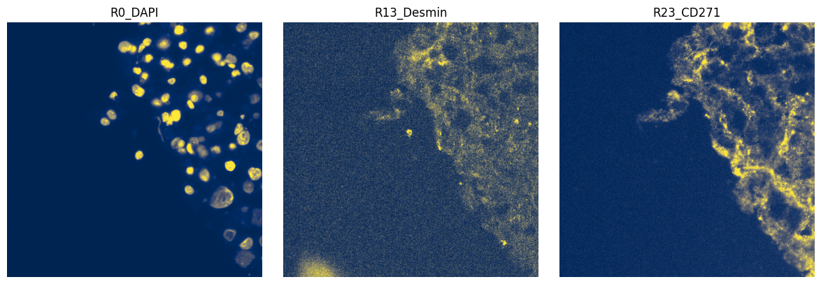
2. Plot the image#
We can plot the image to see what it looks like. For this we can use the harpy.pl.plot_sdata function. Note that image intensities are not normalized, so combined plotting of channels (e.g. as an RGB image) may not be very informative.
import numpy as np
import dask.array as da
from matplotlib.colors import Normalize

subset_channels = ["R0_DAPI", "R13_Desmin", "R23_CD271"]

fig, axes = plt.subplots(1, 3, figsize=(12, 4))

for _ax, _channel in zip(axes, subset_channels, strict=True):
    # normalization parameters for visualization (underlying image not changed)
    se = hp.im.get_dataarray(sdata, element_name="HumanLiverH35")
    _channel_idx = np.where(sdata["HumanLiverH35"].c.data == _channel)[0].item()
    vmax = da.percentile(se.data[_channel_idx].flatten(), q=99).compute()
    norm = Normalize(vmax=vmax, clip=False)

    render_images_kwargs = {"cmap": "cividis", "norm": norm}
    show_kwargs = {"title": _channel, "colorbar": False}
    _ax = hp.pl.plot_sdata(
        sdata,
        image_name="HumanLiverH35",
        channel=_channel,
        render_images_kwargs=render_images_kwargs,
        show_kwargs=show_kwargs,
        ax=_ax,
    )
    # frameless figure
    _ax.axis("off")

plt.tight_layout()
plt.show()
3. Segment using Cellpose#
# we first back the spatialdata object to a zarr store:
import os
import tempfile
import uuid

from spatialdata import read_zarr

OUTPUT_DIR = tempfile.gettempdir()

zarr_path = os.path.join(OUTPUT_DIR, f"sdata_{uuid.uuid4()}.zarr")

sdata.write(zarr_path, overwrite=True)
sdata = read_zarr(sdata.path)
import torch
from dask.distributed import Client, LocalCluster

from harpy.image import cellpose_callable

image_name = "HumanLiverH35"

# Get the DAPI stain, and add it to a new slot.
sdata = hp.im.add_image(
    sdata,
    arr=sdata[image_name].sel(c="R0_DAPI").data[None, ...],
    output_image_name="image",
    overwrite=True,
)

if torch.cuda.is_available():
    from dask_cuda import LocalCUDACluster  # pip install dask-cuda

    # One worker per GPU; each worker will be pinned to a single GPU.
    cluster = LocalCUDACluster(
        CUDA_VISIBLE_DEVICES=[0],  # or [0,1],...etc
        n_workers=1,  # 2 if [0,1],...etc
        threads_per_worker=1,
        memory_limit="32GB",
        # local_directory=os.environ.get( "TMPDIR" ),
    )
else:
    # cpu/mps fall back
    from dask.distributed import LocalCluster

    cluster = LocalCluster(
        n_workers=1
        if torch.backends.mps.is_available()
        else 8,  # If mps/cuda device available, it is better to increase chunk size to maximal value that fits on the gpu, and set n_workers to 1.
        # For this dummy example, we only have one chunk, so setting n_workers>1, has no effect.
        threads_per_worker=1,
        memory_limit="32GB",
        # local_directory=os.environ.get( "TMPDIR" ),
    )

client = Client(cluster)

print(client.dashboard_link)
http://127.0.0.1:57589/status
# segment the DAPI stain
sdata = hp.im.segment(
    sdata,
    image_name="image",
    depth=200,
    model=cellpose_callable,
    diameter=50,
    flow_threshold=0.8,
    cellprob_threshold=-4,
    output_labels_name="segmentation_mask",
    output_shapes_name="segmentation_mask_boundaries",
    overwrite=True,
)

client.close()
4. Visualize resulting segmentation#
fig, axes = plt.subplots(1, 2, figsize=(10, 5))

channel = "R0_DAPI"
# normalization parameters for visualization (underlying image not changed)
se = hp.im.get_dataarray(sdata, element_name="HumanLiverH35")
channel_idx = np.where(sdata["HumanLiverH35"].c.data == channel)[0].item()
vmax = da.percentile(se.data[channel_idx].flatten(), q=99).compute()
norm = Normalize(vmax=vmax, clip=False)

render_images_kwargs = {"cmap": "cividis", "norm": norm}
render_labels_kwargs = {"fill_alpha": 0.6, "outline_alpha": 0.4}
show_kwargs = {"title": channel, "colorbar": False}
_ax = hp.pl.plot_sdata(
    sdata,
    image_name="HumanLiverH35",
    channel=channel,
    render_images_kwargs=render_images_kwargs,
    show_kwargs=show_kwargs,
    ax=axes[0],
)
_ax.axis("off")

show_kwargs = {"title": "Segmentation mask", "colorbar": False}
_ax = hp.pl.plot_sdata(
    sdata,
    image_name="HumanLiverH35",
    labels_name="segmentation_mask",
    channel=channel,
    render_images_kwargs=render_images_kwargs,
    render_labels_kwargs=render_labels_kwargs,
    show_kwargs=show_kwargs,
    ax=axes[1],
)
_ax.axis("off")

plt.tight_layout()
plt.show()
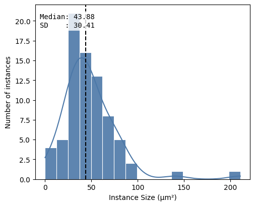
df = hp.qc.segmentation_coverage(
    sdata,
    labels_name="segmentation_mask",
    microns_per_pixel=microns_per_pixel,
)
display(df)
hp.qc.segmentation_histogram(
    sdata,
    labels_name="segmentation_mask",
    microns_per_pixel=microns_per_pixel,
)
| labels_name | total_instances | total_area_μm² | covered_area_μm² | covered_area_percentage | |
|---|---|---|---|---|---|
| 0 | segmentation_mask | 76 | 28900.0 | 3673.6813 | 12.7117 |
<Axes: xlabel='Instance Size (μm²)', ylabel='Number of instances'>
5. Feature extraction#
Now we have the location of the cells, we can try to extract features from the image to represent the expression of each cell for the marker. There are many different ways to summarize the signal to a single value. When working on spatial proteomics, it is common to use the mean intensity of the pixels in the cell instead of e.g. the count of transcripts. The mean intensity is a simple and fast way to summarize the signal, but it can be sensitive to noise. A more robust way is to use a quantile normalization first to remove intensity outliers and then calculate the mean intensity. Note that we expect the whole-slide image to be already corrected for illumination and background.
You should inspect the normalized images for each channel, as rare or abundant markers may have different distributions and need different q_min and q_max values, which harpy.im.normalize supports.
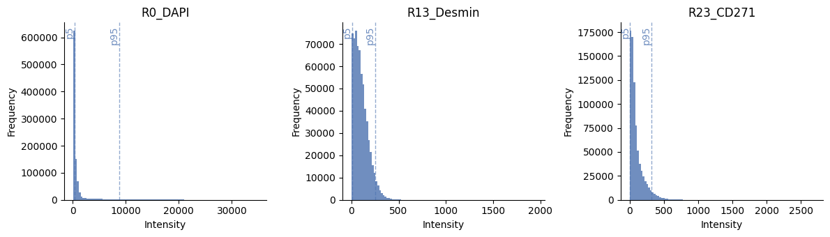
# show histograms of a few channels
ax = hp.qc.image_histogram(
    sdata,
    image_name="HumanLiverH35",
    channel=subset_channels,
    ncols=4,
    bins=100,
    percentile_lines=[5, 95],
)
sdata = hp.im.normalize(
    sdata,
    image_name="HumanLiverH35",
    output_image_name="HumanLiverH35_normalized_image",
    p_min=5,
    p_max=95,
    overwrite=True,
)
sdata
SpatialData object, with associated Zarr store: /private/var/folders/sz/t3tgg4fs4tz9btm0fbqg_tzc0000gn/T/sdata_67f659db-6bda-4c08-993f-c54d3da20c2c.zarr
├── Images
│     ├── 'HumanLiverH35': DataArray[cyx] (151, 1000, 1000)
│     ├── 'HumanLiverH35_normalized_image': DataArray[cyx] (151, 1000, 1000)
│     └── 'image': DataArray[cyx] (1, 1000, 1000)
├── Labels
│     └── 'segmentation_mask': DataArray[yx] (1000, 1000)
└── Shapes
      └── 'segmentation_mask_boundaries': GeoDataFrame shape: (76, 1) (2D shapes)
with coordinate systems:
    ▸ 'global', with elements:
        HumanLiverH35 (Images), HumanLiverH35_normalized_image (Images), image (Images), segmentation_mask (Labels), segmentation_mask_boundaries (Shapes)
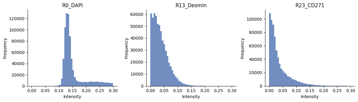
# show histograms of a few channels
ax = hp.qc.image_histogram(
    sdata,
    image_name="HumanLiverH35_normalized_image",
    channel=subset_channels,
    ncols=4,
    bins=50,
    range=[0, 0.3],
)
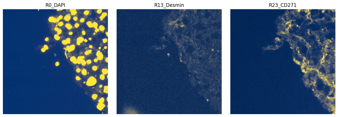
import numpy as np
import dask.array as da
from matplotlib.colors import Normalize

subset_channels = ["R0_DAPI", "R13_Desmin", "R23_CD271"]

fig, axes = plt.subplots(1, 3, figsize=(12, 4))

for _ax, _channel in zip(axes, subset_channels, strict=True):
    # normalization parameters for visualization (underlying image not changed)
    se = hp.im.get_dataarray(sdata, element_name="HumanLiverH35_normalized_image")
    if _channel == "R0_DAPI":
        norm = Normalize(vmax=1.0, clip=False)
    else:
        norm = Normalize(vmax=0.2, clip=False)
    render_images_kwargs = {"cmap": "cividis", "norm": norm}
    show_kwargs = {"title": _channel, "colorbar": False}
    _ax = hp.pl.plot_sdata(
        sdata,
        image_name="HumanLiverH35_normalized_image",
        channel=_channel,
        render_images_kwargs=render_images_kwargs,
        show_kwargs=show_kwargs,
        ax=_ax,
    )
    # frameless figure
    _ax.axis("off")

plt.tight_layout()
plt.show()
Calculating the features for every cell is an intensive process and can take some time. For this small example of 70 cells and 10 channels it takes one second; for 51 channels, it takes around 3 seconds.
sdata = hp.tb.allocate_intensity(
    sdata,
    image_name="HumanLiverH35_normalized_image",
    labels_name="segmentation_mask",
    output_table_name="table_intensities",
    mode="mean",
    obs_stats="var",
    channels=markers_of_interest[:9],
)
sdata
SpatialData object, with associated Zarr store: /private/var/folders/sz/t3tgg4fs4tz9btm0fbqg_tzc0000gn/T/sdata_67f659db-6bda-4c08-993f-c54d3da20c2c.zarr
├── Images
│     ├── 'HumanLiverH35': DataArray[cyx] (151, 1000, 1000)
│     ├── 'HumanLiverH35_normalized_image': DataArray[cyx] (151, 1000, 1000)
│     └── 'image': DataArray[cyx] (1, 1000, 1000)
├── Labels
│     └── 'segmentation_mask': DataArray[yx] (1000, 1000)
├── Shapes
│     └── 'segmentation_mask_boundaries': GeoDataFrame shape: (76, 1) (2D shapes)
└── Tables
      └── 'table_intensities': AnnData (76, 9)
with coordinate systems:
    ▸ 'global', with elements:
        HumanLiverH35 (Images), HumanLiverH35_normalized_image (Images), image (Images), segmentation_mask (Labels), segmentation_mask_boundaries (Shapes)
display(sdata["table_intensities"].to_df().head())
display(sdata["table_intensities"].obs.head())
| channels | R1_VSIG4 | R1_CD14 | R2_CD163 | R3_CD11c | R3_CD335 | R4_CD141 | R5_CD169 | R5_CD49d | R6_CD279 |
|---|---|---|---|---|---|---|---|---|---|
| cells | |||||||||
| 32_segmentation_mask_3b11d217 | 0.870907 | 0.003107 | 0.069971 | 0.031215 | 0.020135 | 0.056344 | 0.046155 | 0.052357 | 0.042079 |
| 33_segmentation_mask_3b11d217 | 0.898182 | 0.040555 | 0.076170 | 0.033018 | 0.018910 | 0.040466 | 0.039408 | 0.130972 | 0.031559 |
| 34_segmentation_mask_3b11d217 | 0.812752 | 0.005594 | 0.070789 | 0.026264 | 0.012096 | 0.031035 | 0.028143 | 0.009778 | 0.028780 |
| 35_segmentation_mask_3b11d217 | 0.821199 | 0.004960 | 0.062773 | 0.026588 | 0.012943 | 0.036027 | 0.031662 | 0.011905 | 0.027374 |
| 36_segmentation_mask_3b11d217 | 0.878763 | 0.007762 | 0.081625 | 0.035347 | 0.015306 | 0.035281 | 0.040076 | 0.019484 | 0.030836 |
| cell_ID | fov_labels | var_R1_VSIG4 | var_R1_CD14 | var_R2_CD163 | var_R3_CD11c | var_R3_CD335 | var_R4_CD141 | var_R5_CD169 | var_R5_CD49d | var_R6_CD279 | |
|---|---|---|---|---|---|---|---|---|---|---|---|
| cells | |||||||||||
| 32_segmentation_mask_3b11d217 | 32 | segmentation_mask | 0.000995 | 0.000018 | 0.002458 | 0.000044 | 0.000030 | 0.001909 | 0.001156 | 0.000269 | 0.001411 |
| 33_segmentation_mask_3b11d217 | 33 | segmentation_mask | 0.004196 | 0.001201 | 0.003505 | 0.001599 | 0.000291 | 0.002041 | 0.002563 | 0.007535 | 0.001444 |
| 34_segmentation_mask_3b11d217 | 34 | segmentation_mask | 0.003428 | 0.000081 | 0.003592 | 0.001423 | 0.000173 | 0.001641 | 0.001385 | 0.000209 | 0.001274 |
| 35_segmentation_mask_3b11d217 | 35 | segmentation_mask | 0.002677 | 0.000071 | 0.002684 | 0.001220 | 0.000204 | 0.001685 | 0.001549 | 0.000136 | 0.001081 |
| 36_segmentation_mask_3b11d217 | 36 | segmentation_mask | 0.002216 | 0.000137 | 0.003789 | 0.001875 | 0.000248 | 0.001630 | 0.002105 | 0.000459 | 0.001290 |
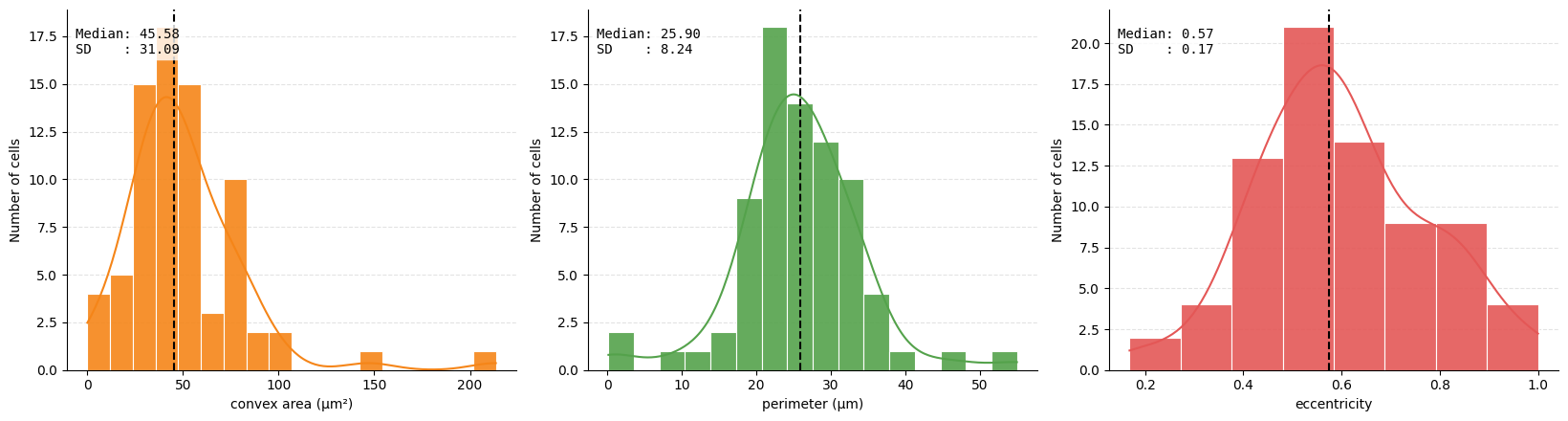
We also can extract geometric and morphological information based on the shape of the cells and append it as extra observations to our table. This can be useful to distinguish between different cell types. For example, we can calculate the area of the cell, the perimeter, the eccentricity, the solidity, the major and minor axis.
sdata = hp.tb.add_regionprops(
    sdata,
    labels_name="segmentation_mask",
    table_name="table_intensities",
    output_table_name="table_intensities",
    properties=["perimeter", "eccentricity", "convex_area"],
    overwrite=True,
)
sdata["table_intensities"].obs["perimeter"] = (
    sdata["table_intensities"].obs["perimeter"] * microns_per_pixel
)
sdata["table_intensities"].obs["convex_area"] = (
    sdata["table_intensities"].obs["convex_area"] * microns_per_pixel**2
)
sdata["table_intensities"].obs[["perimeter", "eccentricity", "convex_area"]].head()
| perimeter | eccentricity | convex_area | |
|---|---|---|---|
| cells | |||
| 32_segmentation_mask_3b11d217 | 0.170000 | 1.000000 | 0.0867 |
| 33_segmentation_mask_3b11d217 | 27.560195 | 0.899292 | 37.1943 |
| 34_segmentation_mask_3b11d217 | 15.124996 | 0.828443 | 15.0858 |
| 35_segmentation_mask_3b11d217 | 12.363747 | 0.853362 | 9.7104 |
| 36_segmentation_mask_3b11d217 | 28.100399 | 0.615135 | 57.1064 |
metrics = (
    ("obs", "convex_area"),
    ("obs", "perimeter"),
    ("obs", "eccentricity"),
)

ax = hp.qc.metrics_histogram(
    sdata,
    labels_name="segmentation_mask",
    table_name="table_intensities",
    display_column=["convex area (μm²)", "perimeter (μm)", "eccentricity"],
    color=[
        "#F58518",
        "#54A24B",
        "#E45756",
    ],
    metrics=metrics,
)
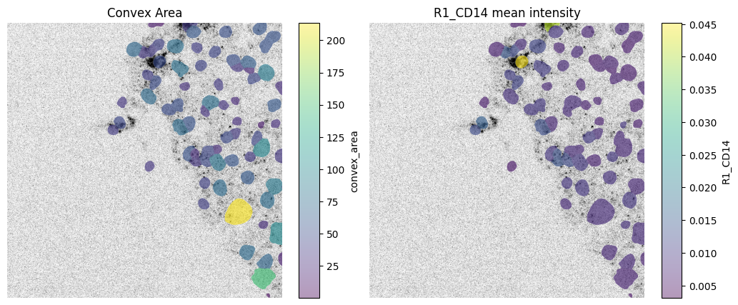
We can spatially visualize both the mean intensity of a given channel and any column from the .obs attribute of the AnnData table 'table_intensities' (which is annotated by the labels element 'segmentation_mask').
fig, axes = plt.subplots(1, 2, figsize=(12, 5))

channel = "R1_CD14"
# normalization parameters for visualization (underlying image not changed)
se = hp.im.get_dataarray(sdata, element_name="HumanLiverH35")
channel_idx = np.where(sdata["HumanLiverH35"].c.data == channel)[0].item()
vmax = da.percentile(se.data[channel_idx].flatten(), q=99).compute()
norm = Normalize(vmax=vmax, clip=False)

render_images_kwargs = {"cmap": "binary", "norm": norm, "colorbar": False}
render_labels_kwargs = {"fill_alpha": 0.6, "outline_alpha": 0.4}

# color by area
color = "convex_area"
show_kwargs = {
    "title": "Convex Area",
    "colorbar": True,
}
ax = hp.pl.plot_sdata(
    sdata,
    image_name="HumanLiverH35",
    channel=channel,
    labels_name="segmentation_mask",
    table_name="table_intensities",
    color=color,
    render_images_kwargs=render_images_kwargs,
    show_kwargs=show_kwargs,
    ax=axes[0],
)
ax.axis("off")

# color by mean intensity
color = channel
show_kwargs = {
    "title": f"{color} mean intensity",
    "colorbar": True,
}
ax = hp.pl.plot_sdata(
    sdata,
    image_name="HumanLiverH35",
    channel=channel,
    labels_name="segmentation_mask",
    table_name="table_intensities",
    color=color,
    render_images_kwargs=render_images_kwargs,
    show_kwargs=show_kwargs,
    ax=axes[1],
)
ax.axis("off")
(np.float64(0.0), np.float64(1000.0), np.float64(1000.0), np.float64(0.0))
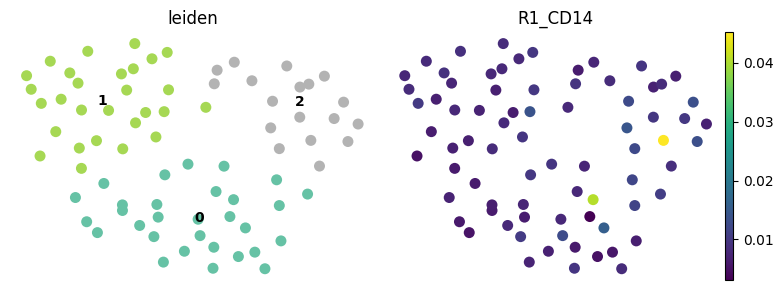
6. Leiden clustering on mean intensity values#
Note that for this dummy example, Leiden clustering will not be very informative.
harpy.tb.leiden is provided as a convenience wrapper around the standard Scanpy workflow, making it easier to run clustering directly on the feature table within a Harpy-based analysis. If preferred, users can also work with the same data using Scanpy directly and run the clustering pipeline manually there.
cluster_key = "leiden"

sdata = hp.tb.leiden(
    sdata,
    labels_name="segmentation_mask",
    table_name="table_intensities",
    output_table_name="table_intensities",
    key_added=cluster_key,
    overwrite=True,
)
# visualize with scanpy
import scanpy as sc
fig, axes = plt.subplots(1, 2, figsize=(8, 3))
sc.pl.umap(
sdata["table_intensities"],
color=cluster_key,
ax=axes[0],
show=False,
size=250,
legend_loc="on data",
frameon=False,
palette="Set2",
)
sc.pl.umap(
sdata["table_intensities"],
color="R1_CD14",
ax=axes[1],
show=False,
size=250,
legend_loc="on data",
frameon=False,
)
plt.tight_layout()
plt.show()
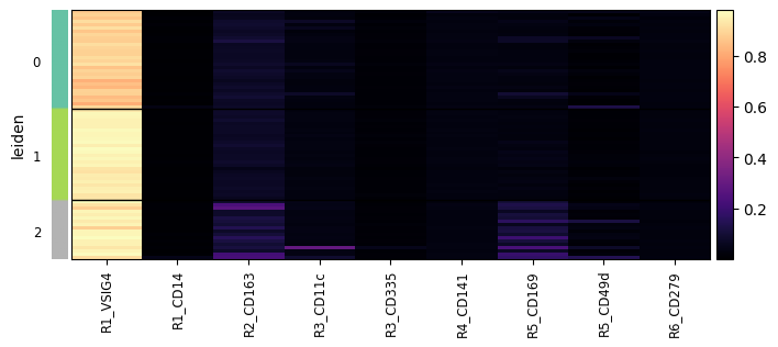
sc.pl.heatmap(
sdata["table_intensities"],
var_names=sdata["table_intensities"].var_names,
groupby=cluster_key,
swap_axes=False,
norm=None,
cmap="magma",
figsize=(8, 3),
show_gene_labels=True,
)
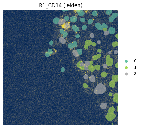
fig, ax = plt.subplots(1, 1, figsize=(12, 5))

channel = "R1_CD14"
# normalization parameters for visualization (underlying image not changed)
se = hp.im.get_dataarray(sdata, element_name="HumanLiverH35")
channel_idx = np.where(sdata["HumanLiverH35"].c.data == channel)[0].item()
vmax = da.percentile(se.data[channel_idx].flatten(), q=99).compute()
norm = Normalize(vmax=vmax, clip=False)

render_images_kwargs = {"cmap": "cividis", "norm": norm}
render_labels_kwargs = {"fill_alpha": 0.6, "outline_alpha": 0.4}

# color by area
color = cluster_key
show_kwargs = {
    "title": f"{channel} ({color})",
    "colorbar": False,
}
ax = hp.pl.plot_sdata(
    sdata,
    image_name="HumanLiverH35",
    channel=channel,
    labels_name="segmentation_mask",
    table_name="table_intensities",
    color=color,
    render_images_kwargs=render_images_kwargs,
    show_kwargs=show_kwargs,
    ax=ax,
)
ax.axis("off")
(np.float64(0.0), np.float64(1000.0), np.float64(1000.0), np.float64(0.0))
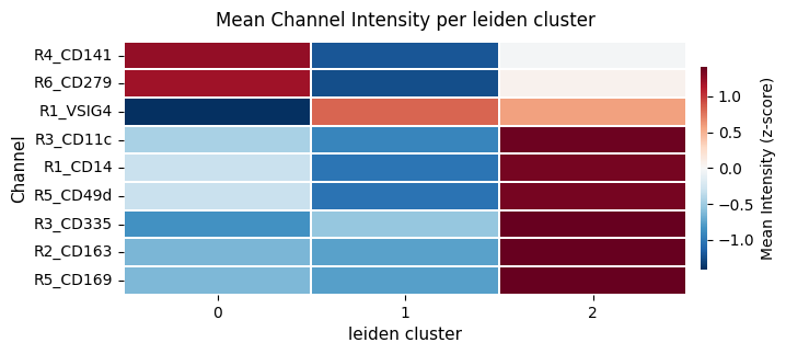
We can also calculate the mean intensity per leiden cluster.
# calculate the mean itensity per leiden cluster
sdata = hp.tb.cluster_intensity(
    sdata,
    table_name="table_intensities",
    labels_name="segmentation_mask",
    output_table_name="table_intensities",
    cluster_key=cluster_key,
    cluster_key_uns=f"{cluster_key}_weighted_intensity",
    overwrite=True,
)

display(sdata["table_intensities"].uns[f"{cluster_key}_weighted_intensity"])

ax = hp.pl.cluster_intensity_heatmap(
    sdata,
    table_name="table_intensities",
    cluster_key="leiden",
    z_score=True,
    figsize=(8, 3),
)
| leiden | R1_VSIG4 | R1_CD14 | R2_CD163 | R3_CD11c | R3_CD335 | R4_CD141 | R5_CD169 | R5_CD49d | R6_CD279 | |
|---|---|---|---|---|---|---|---|---|---|---|
| 0 | 0 | 0.882041 | 0.009115 | 0.078241 | 0.039053 | 0.014705 | 0.034509 | 0.041061 | 0.022107 | 0.030308 |
| 1 | 1 | 0.953930 | 0.008170 | 0.074791 | 0.033652 | 0.015144 | 0.032489 | 0.035639 | 0.015129 | 0.028252 |
| 2 | 2 | 0.946103 | 0.011309 | 0.134847 | 0.060522 | 0.017973 | 0.033466 | 0.123959 | 0.038097 | 0.029353 |